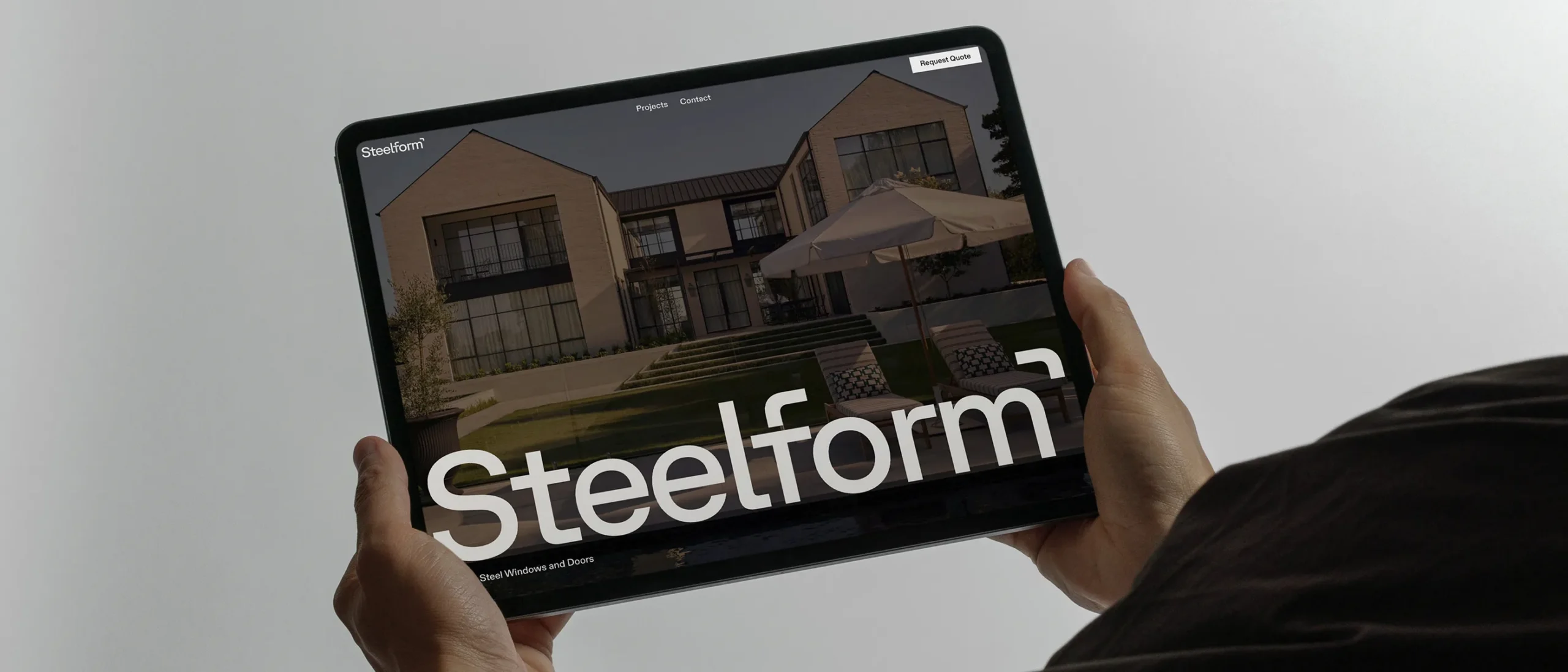
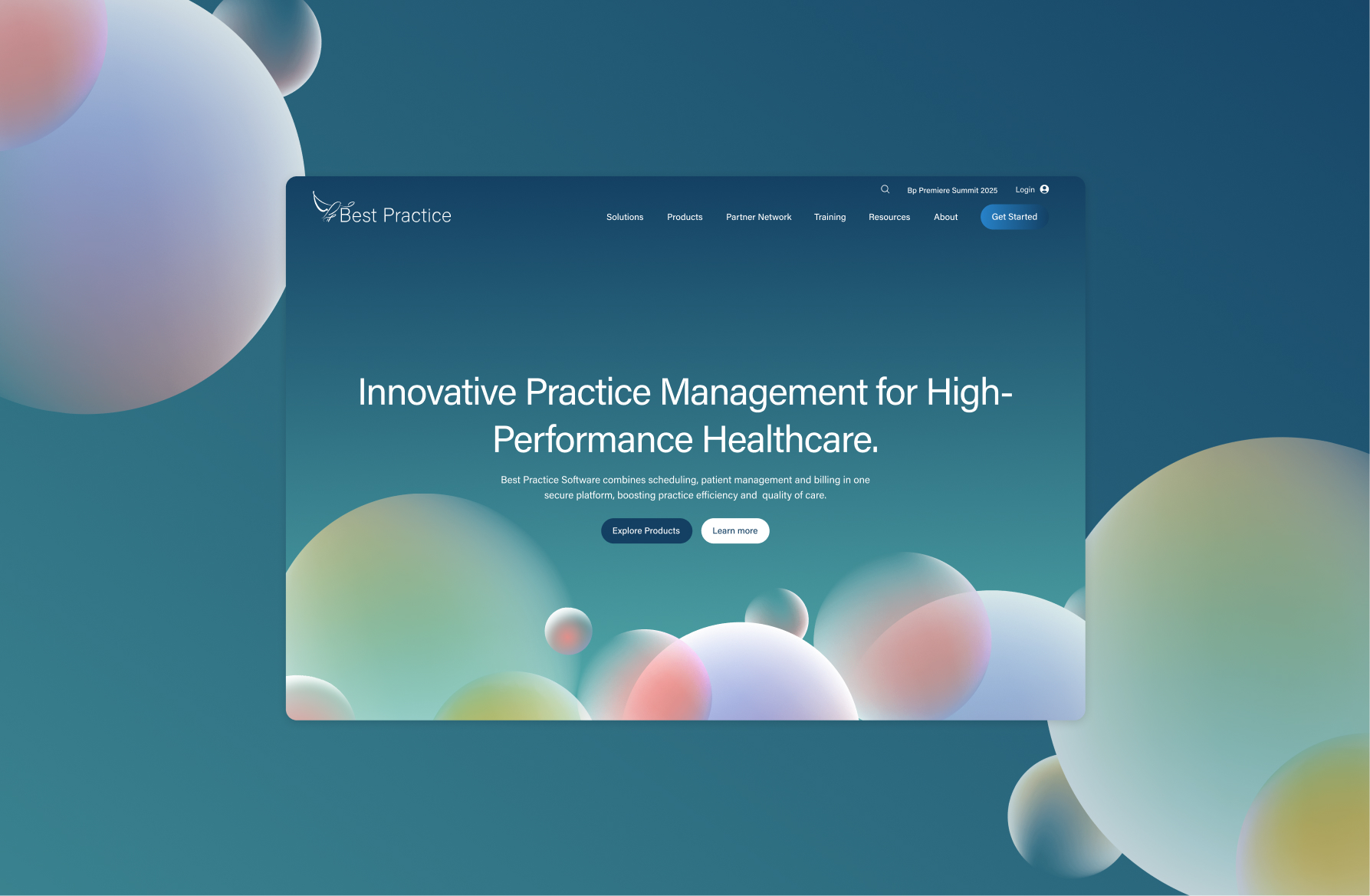
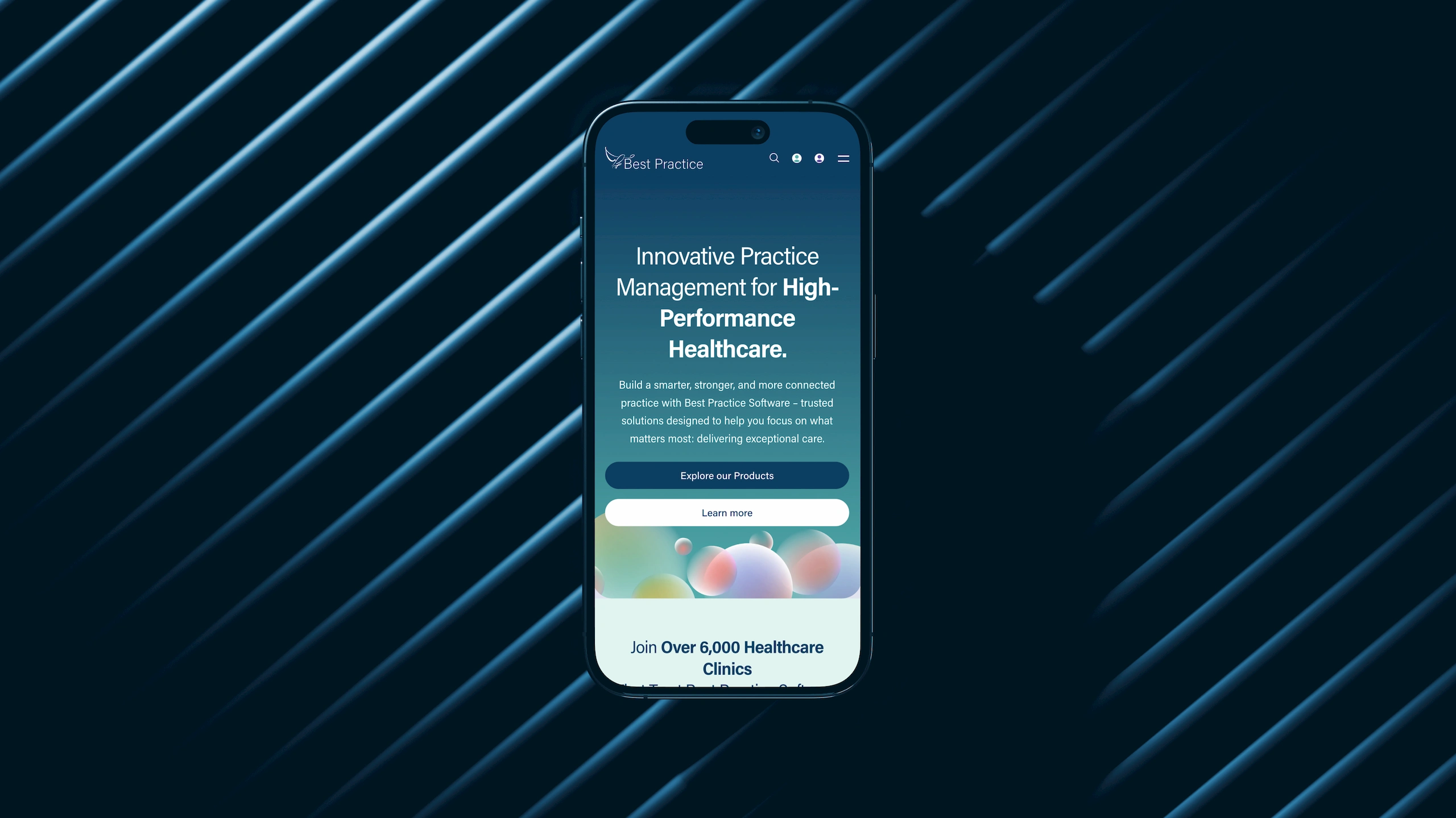
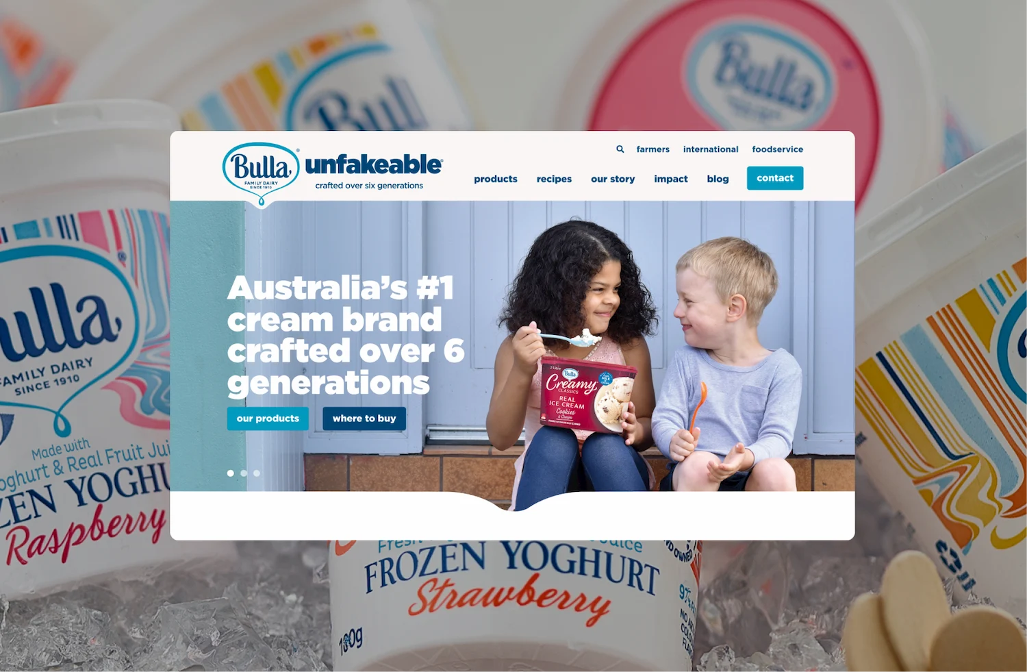
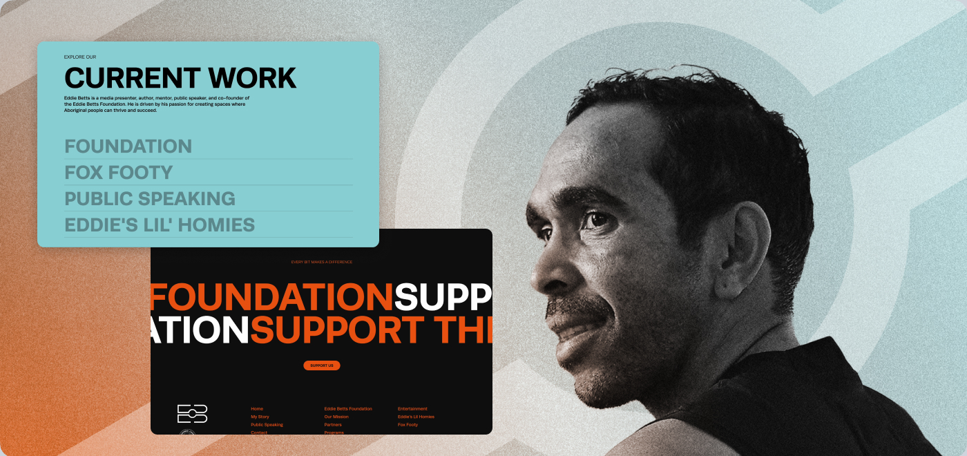
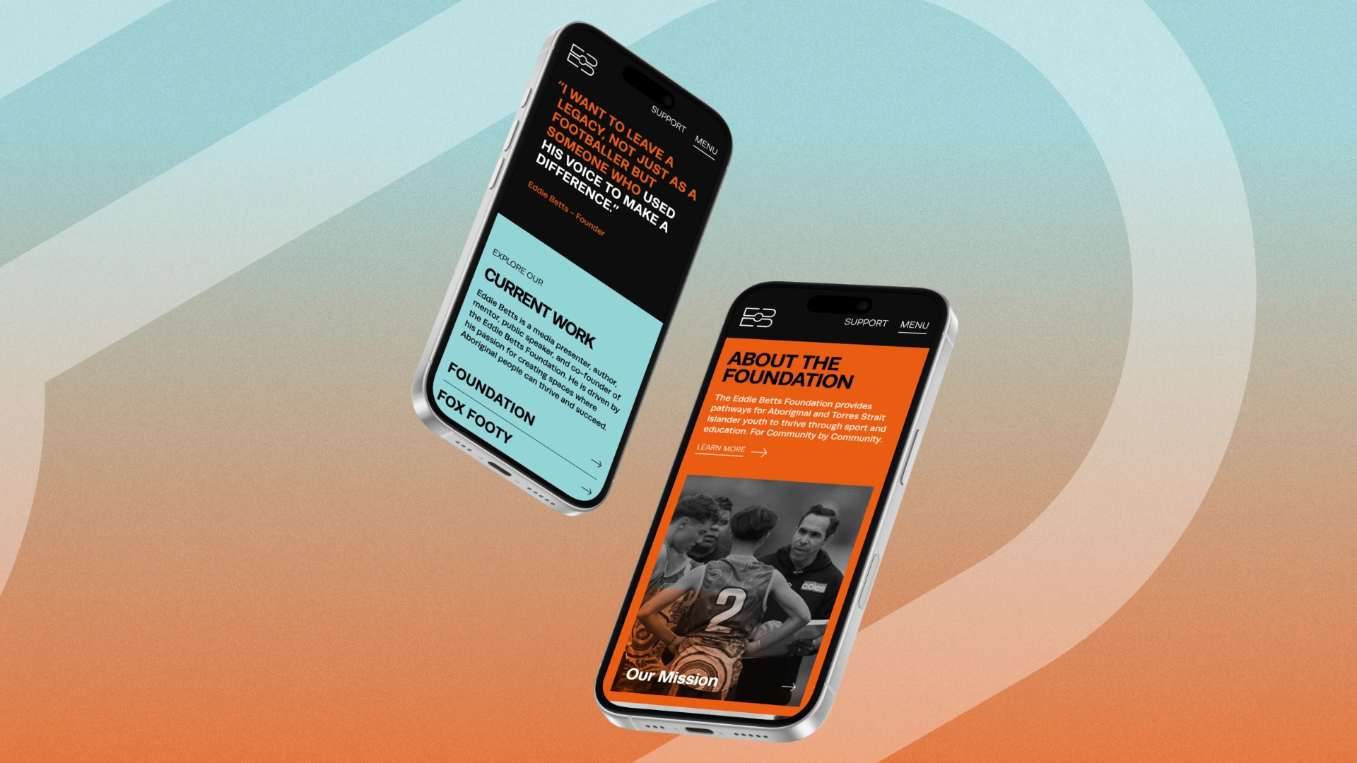
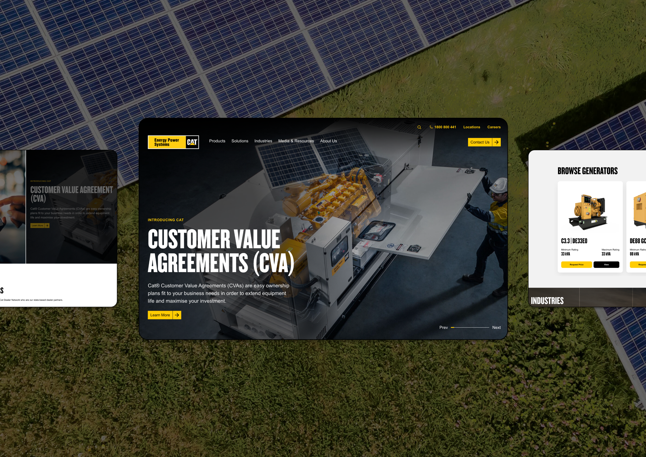
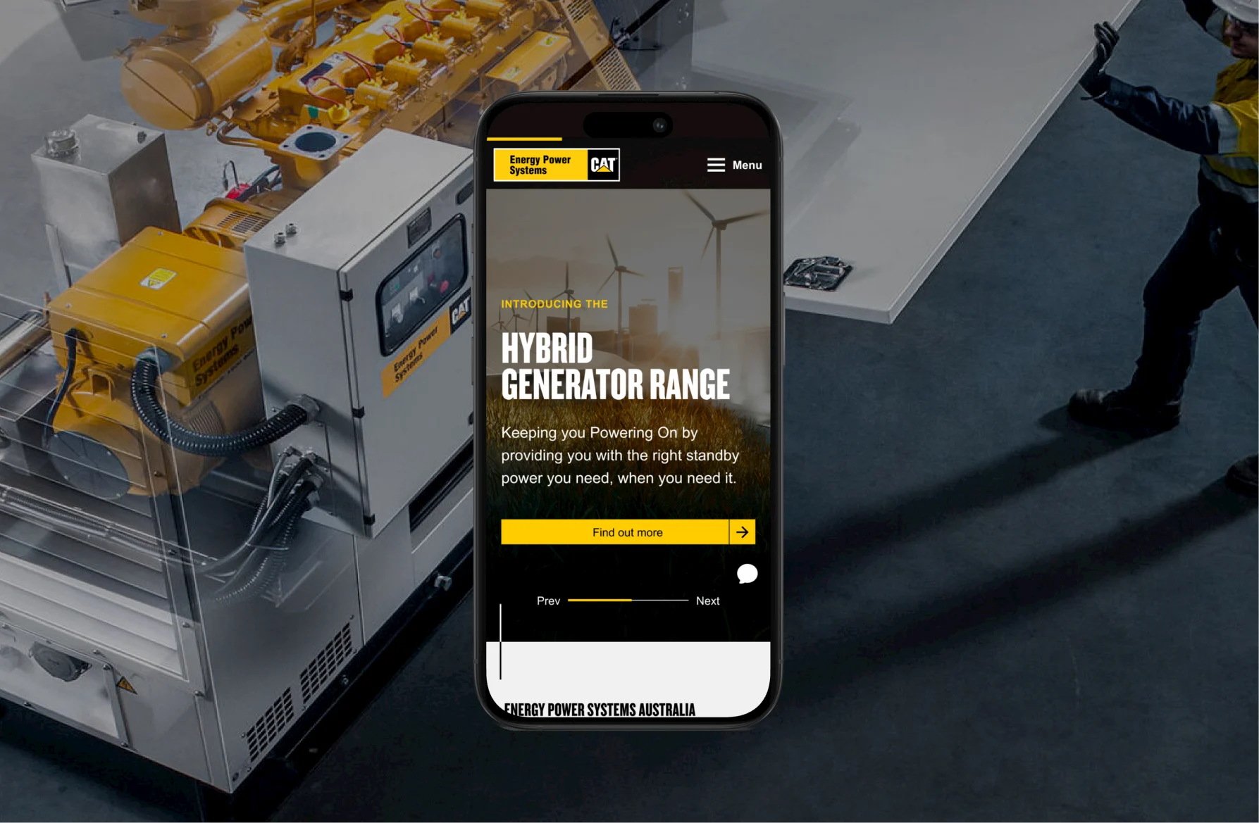
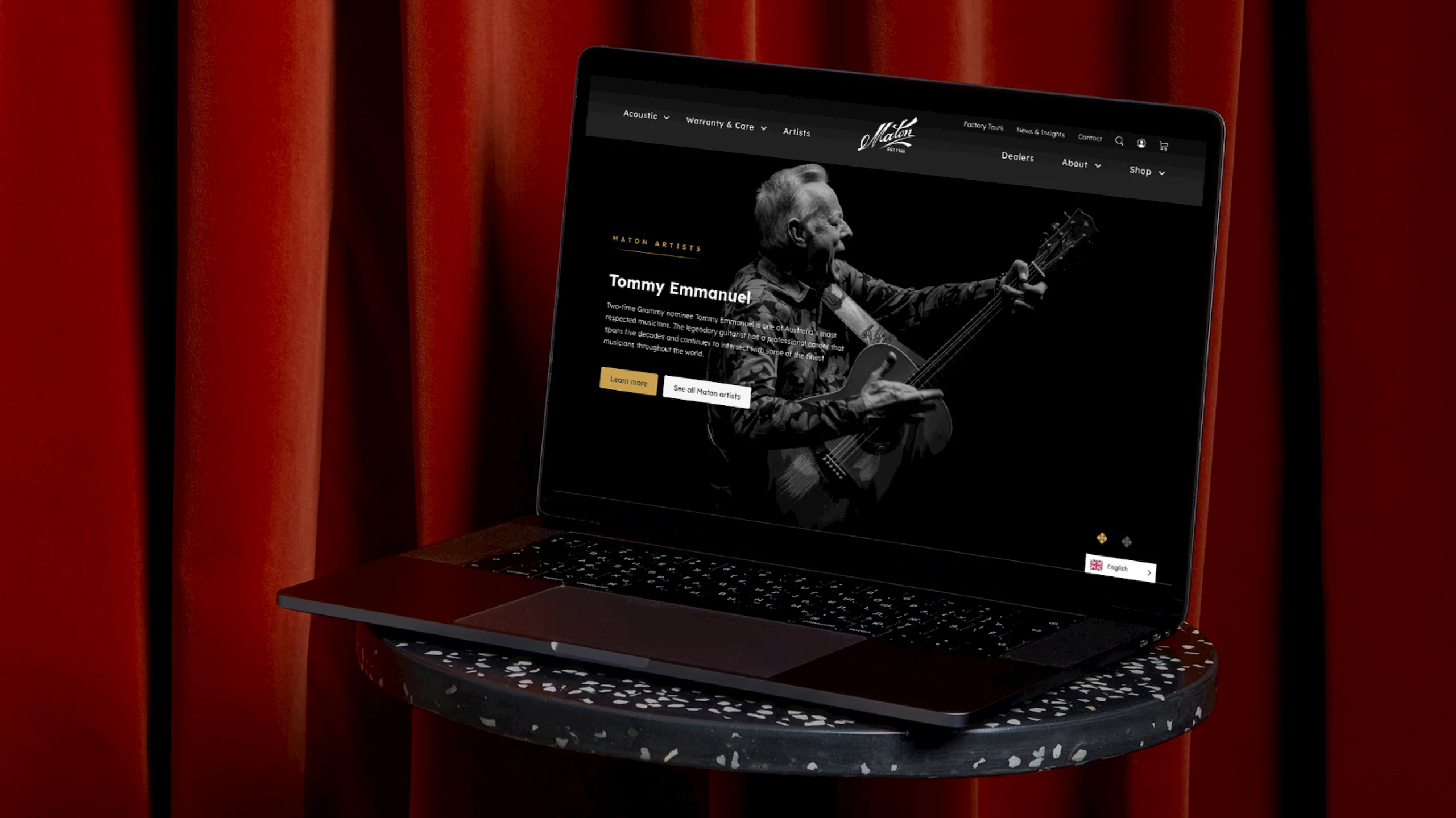
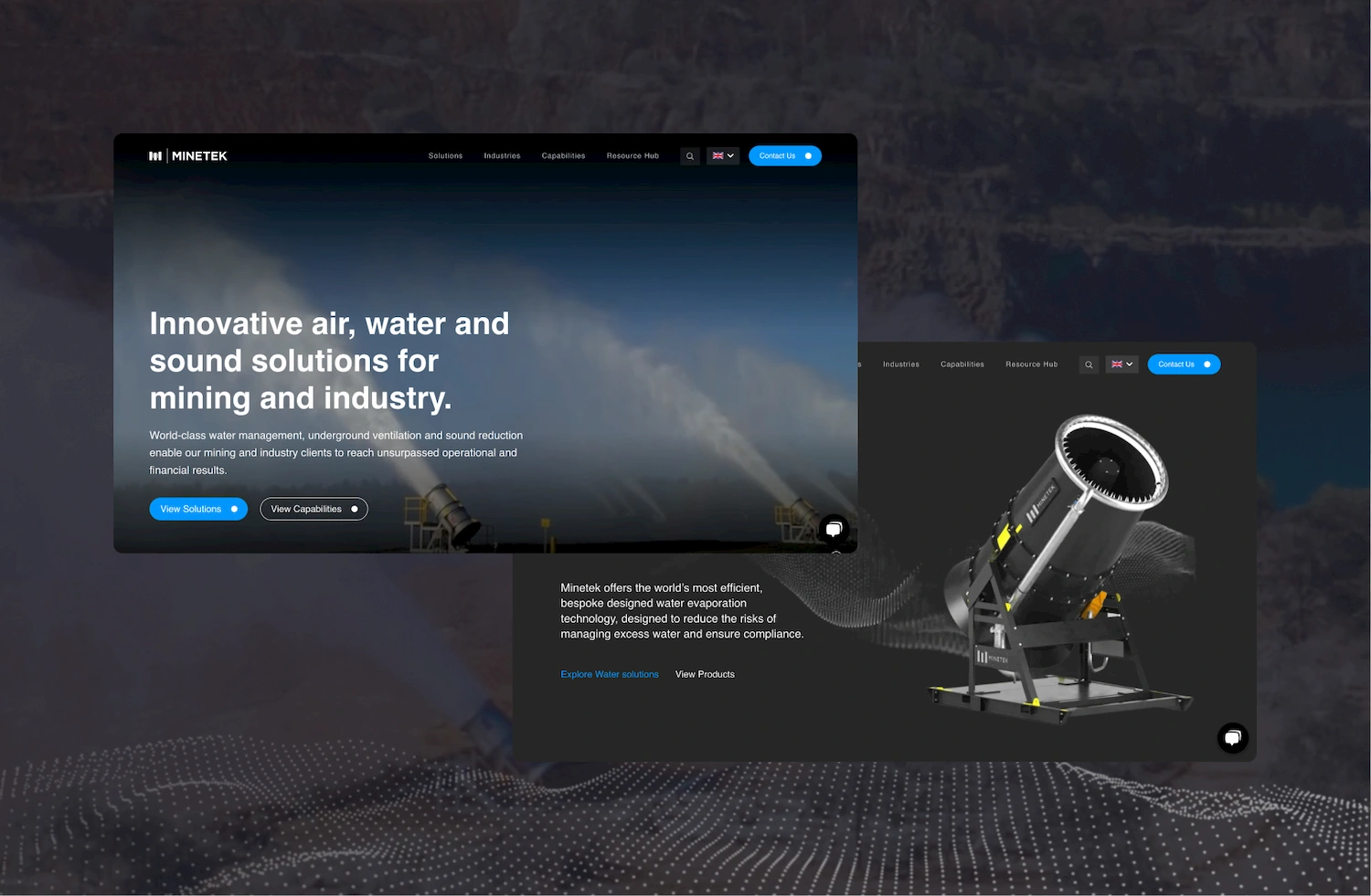
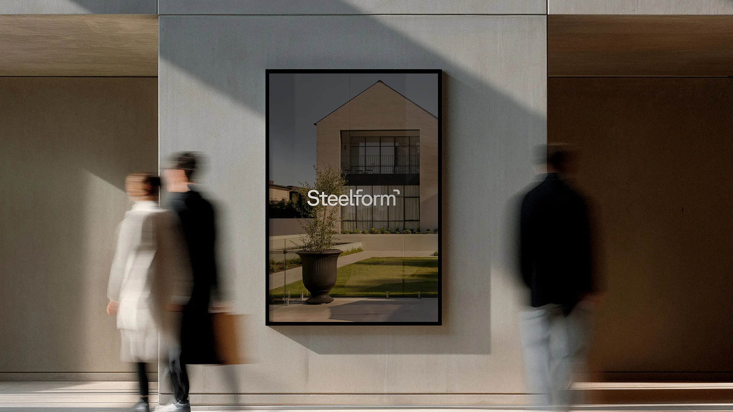
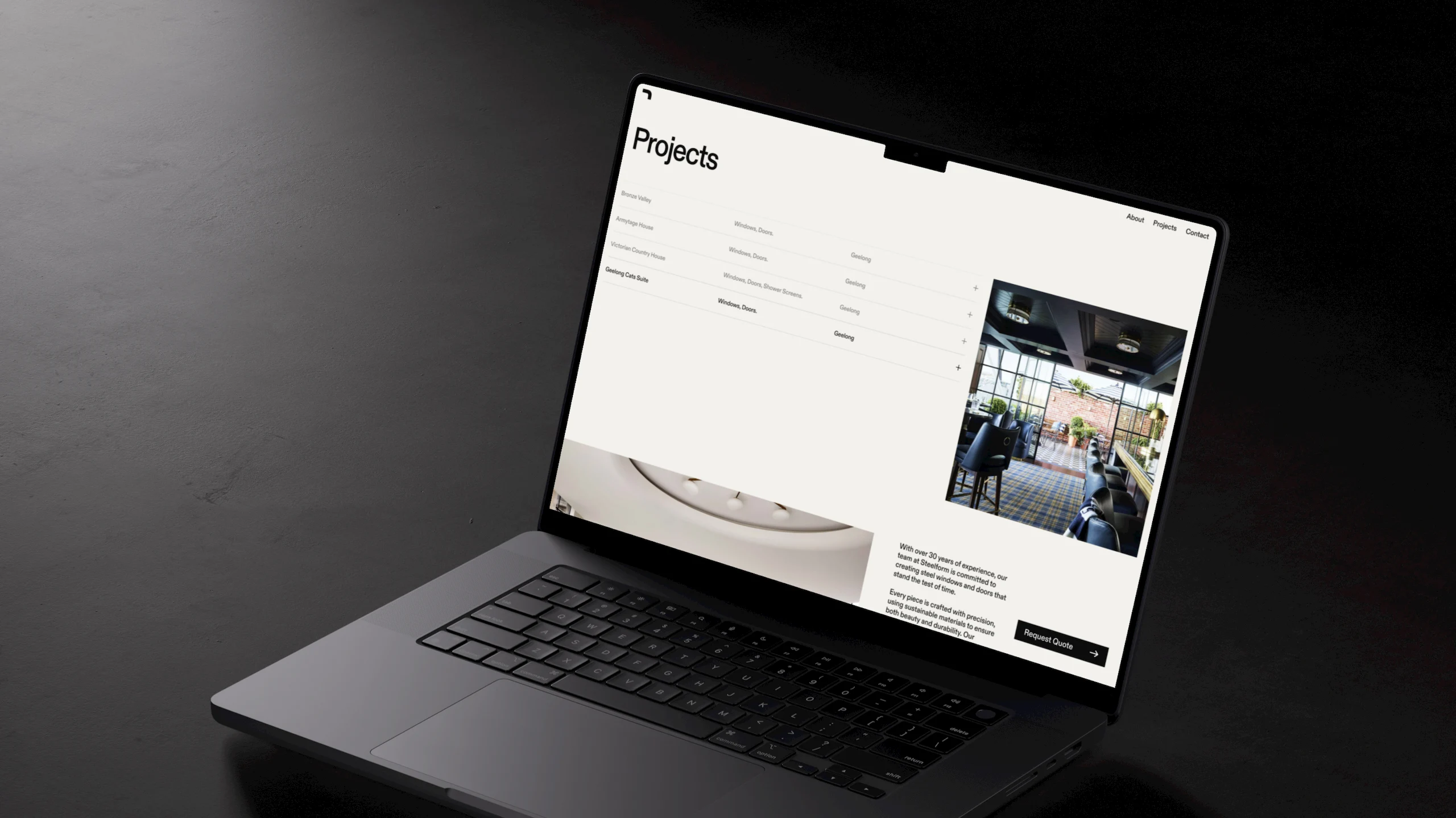
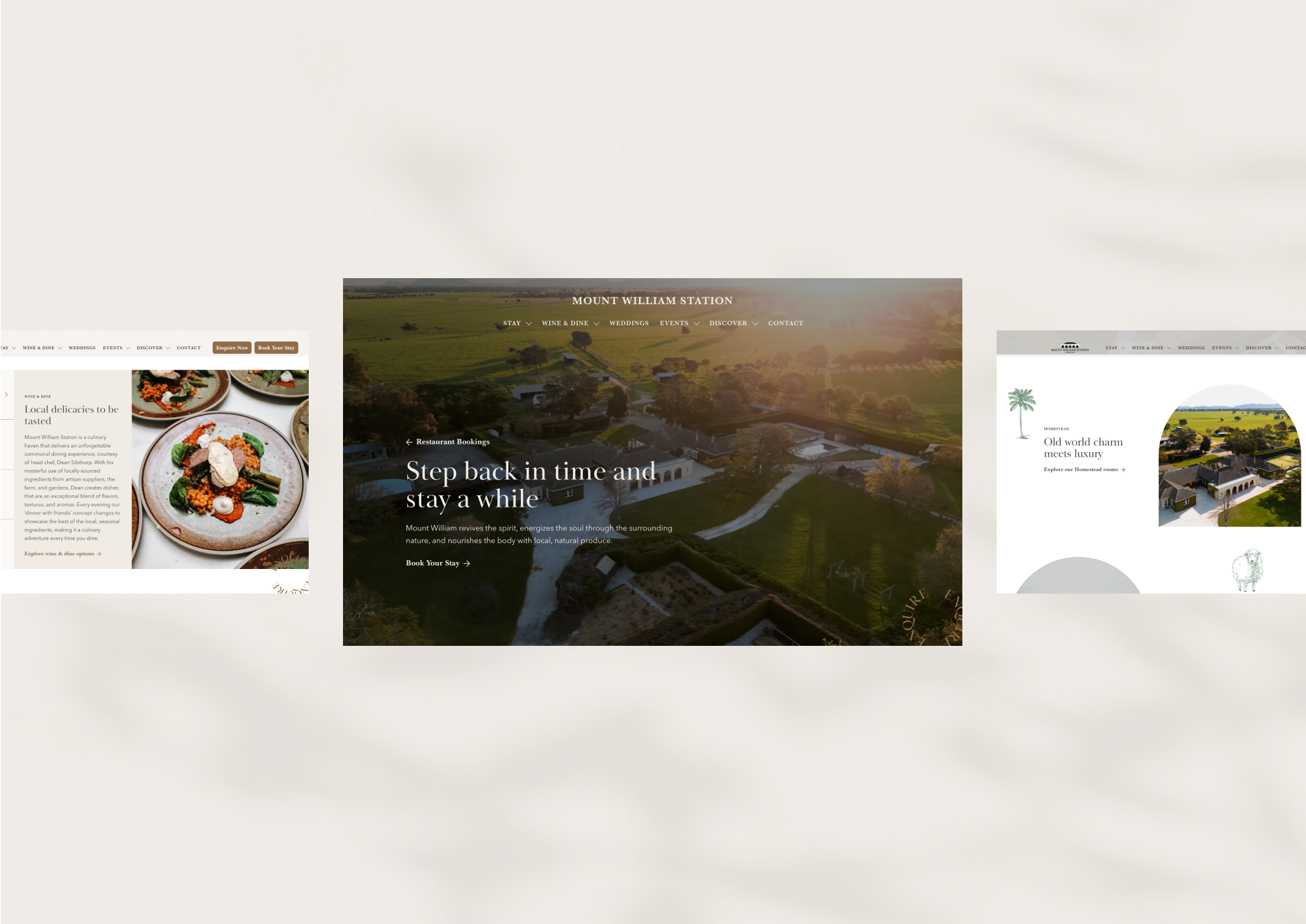
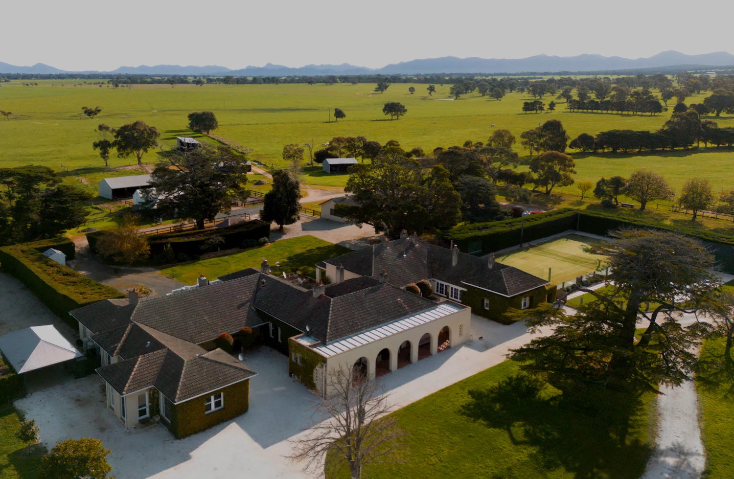
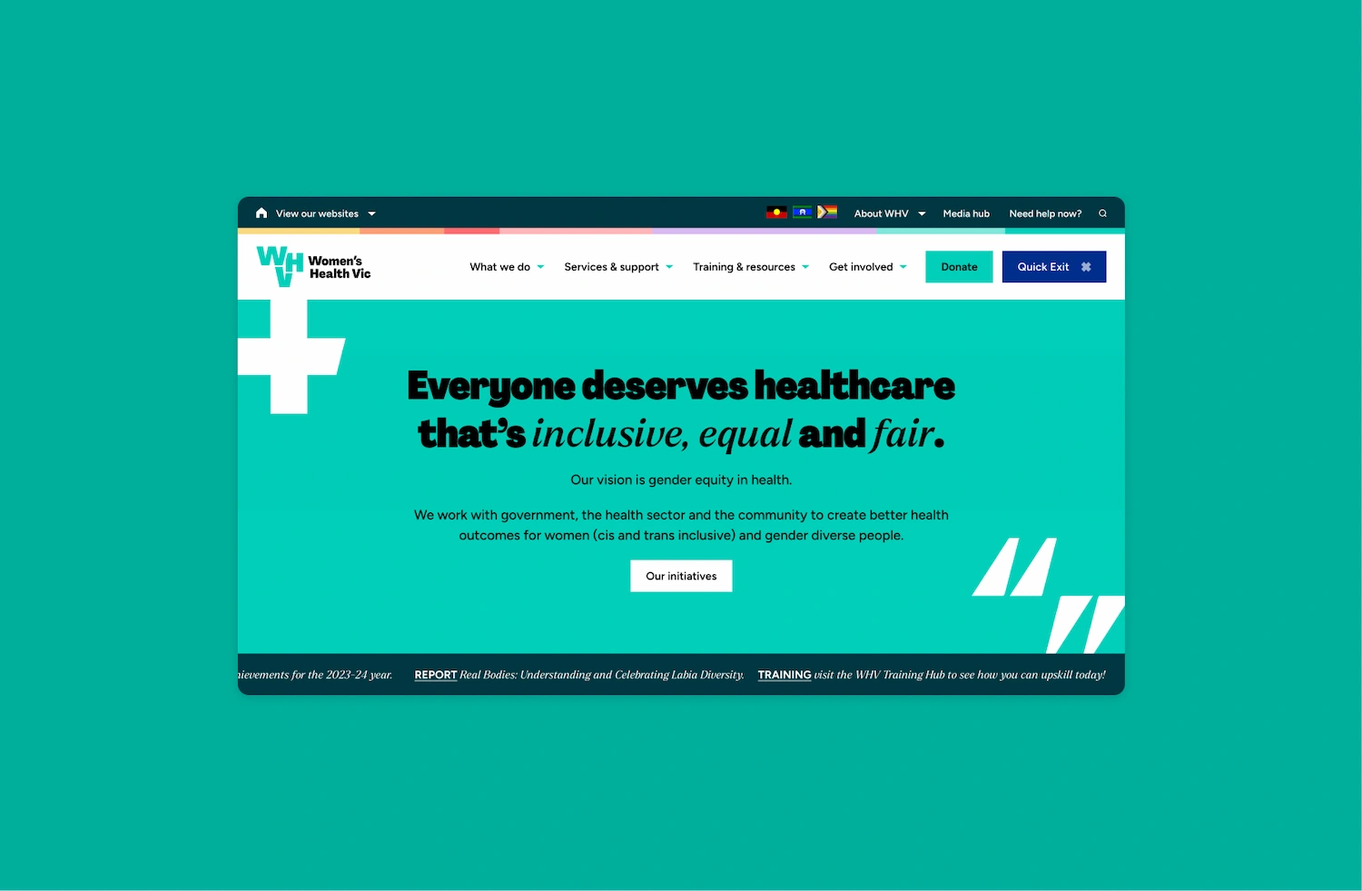
b e a u t i f u l l y d e s i g n e d w e b s i t e s t h a t a r e b u i l t t o p e r f o r m
We ground our process in research and best practice to minimise assumptions. By auditing your current site and analysing competitors, we build a strategy that aligns with your goals.
Our designers and developers work side by side from the very beginning of a project. This close communication ensures creative ideas are feasible, leading to a seamless final build.
We create modular systems that allow your digital presence to grow and evolve over time. By standardising components, we ensure visual consistency and make future updates efficient.
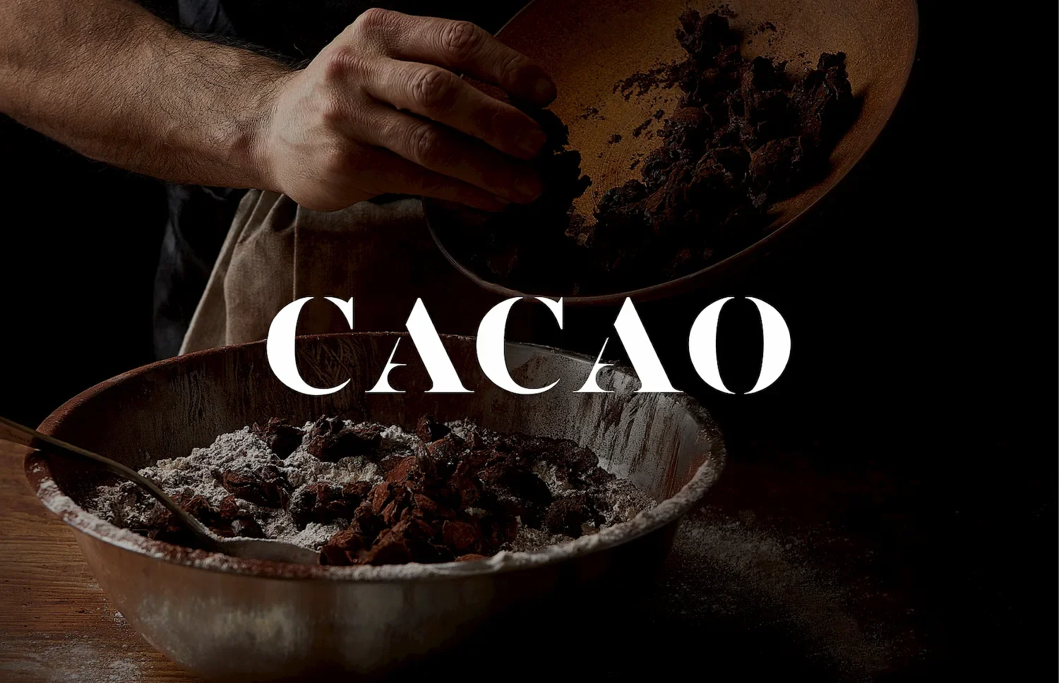
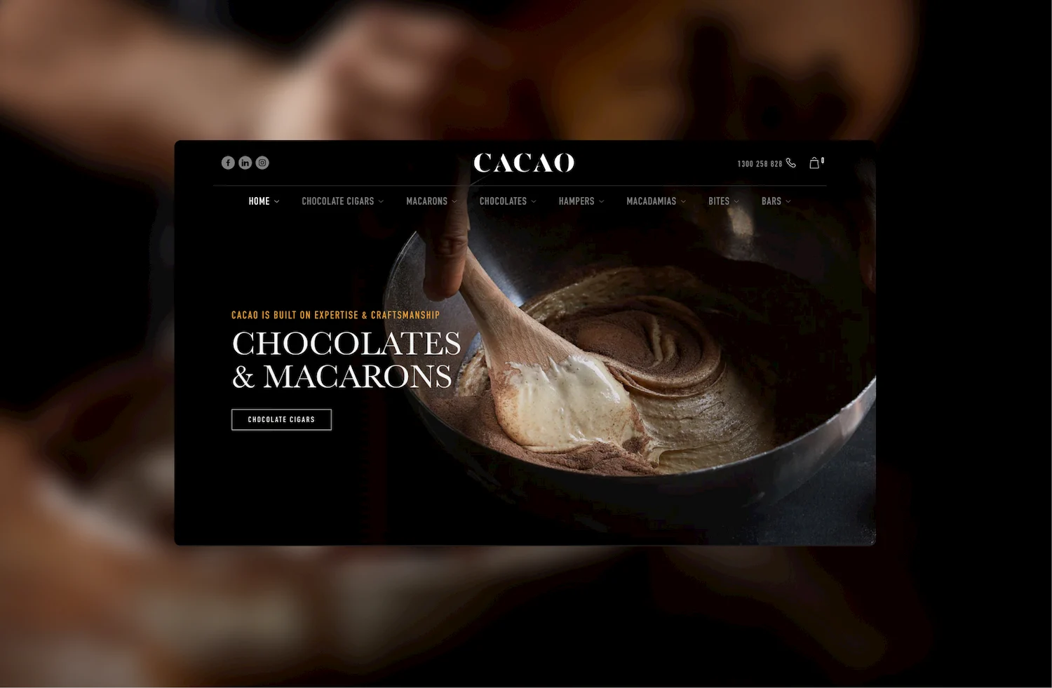
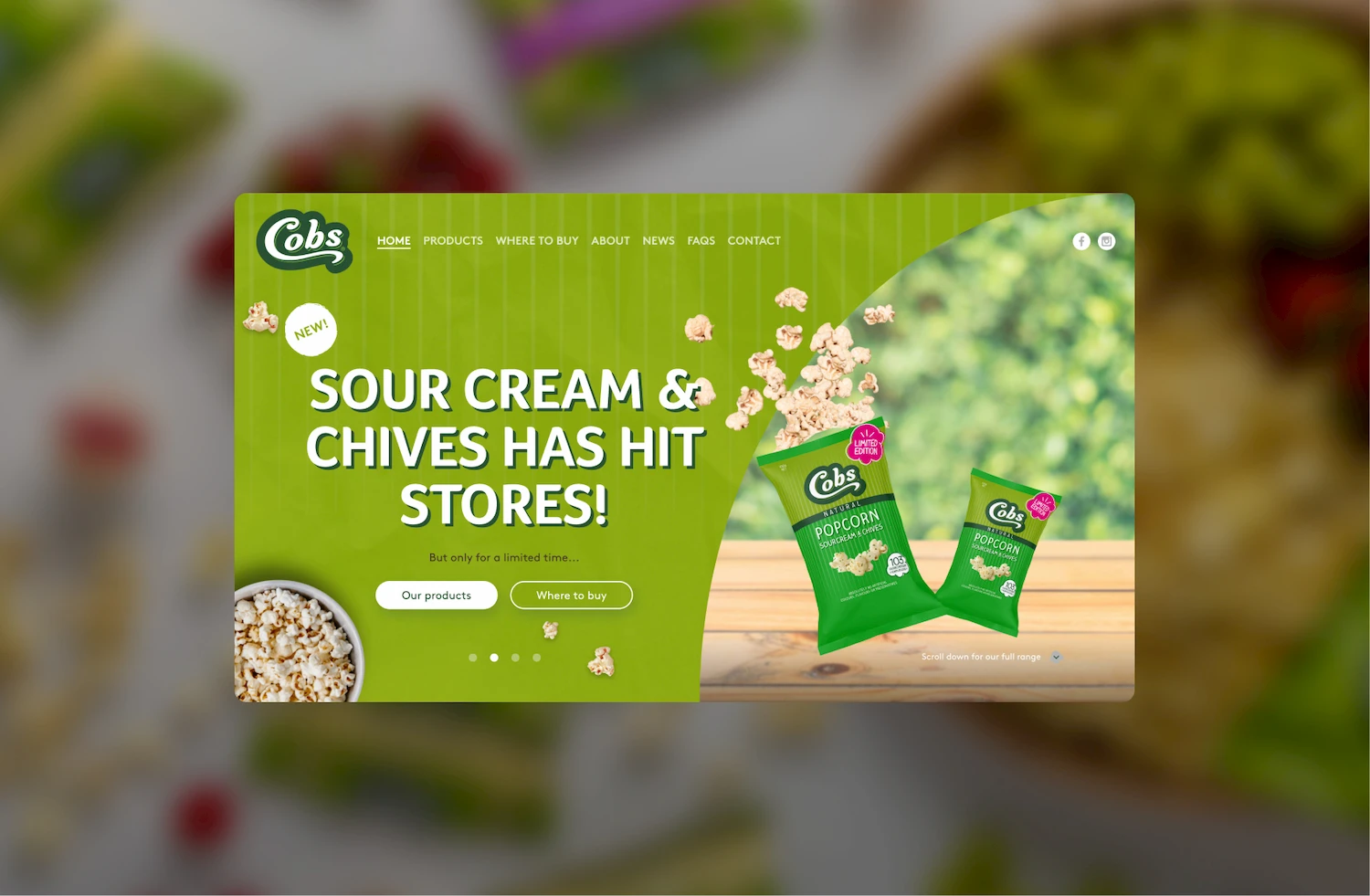
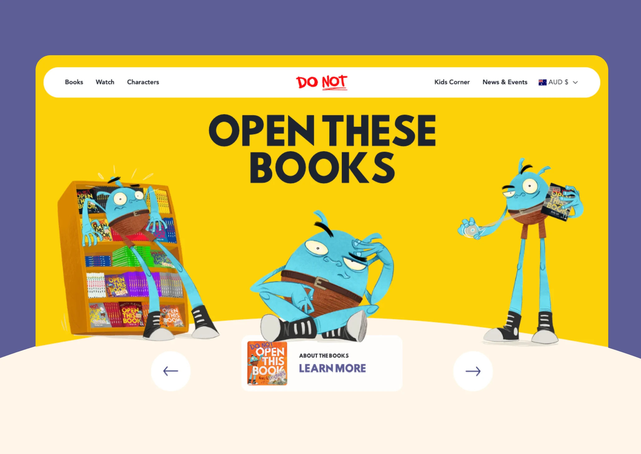
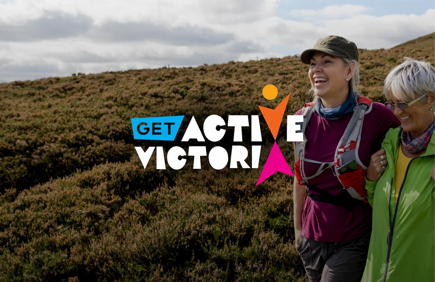
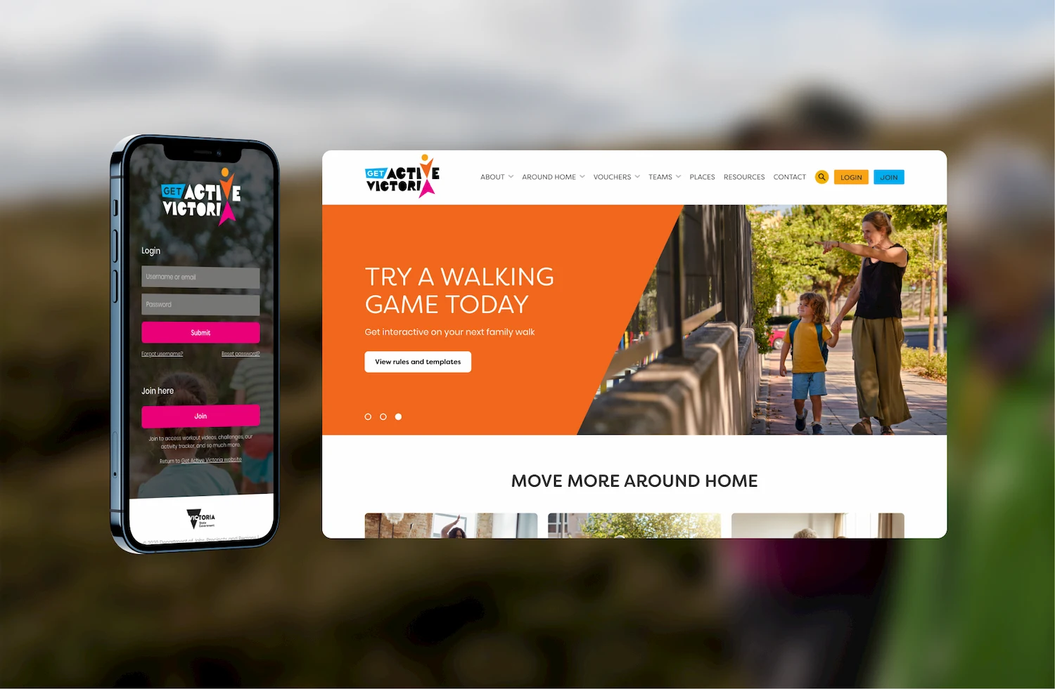
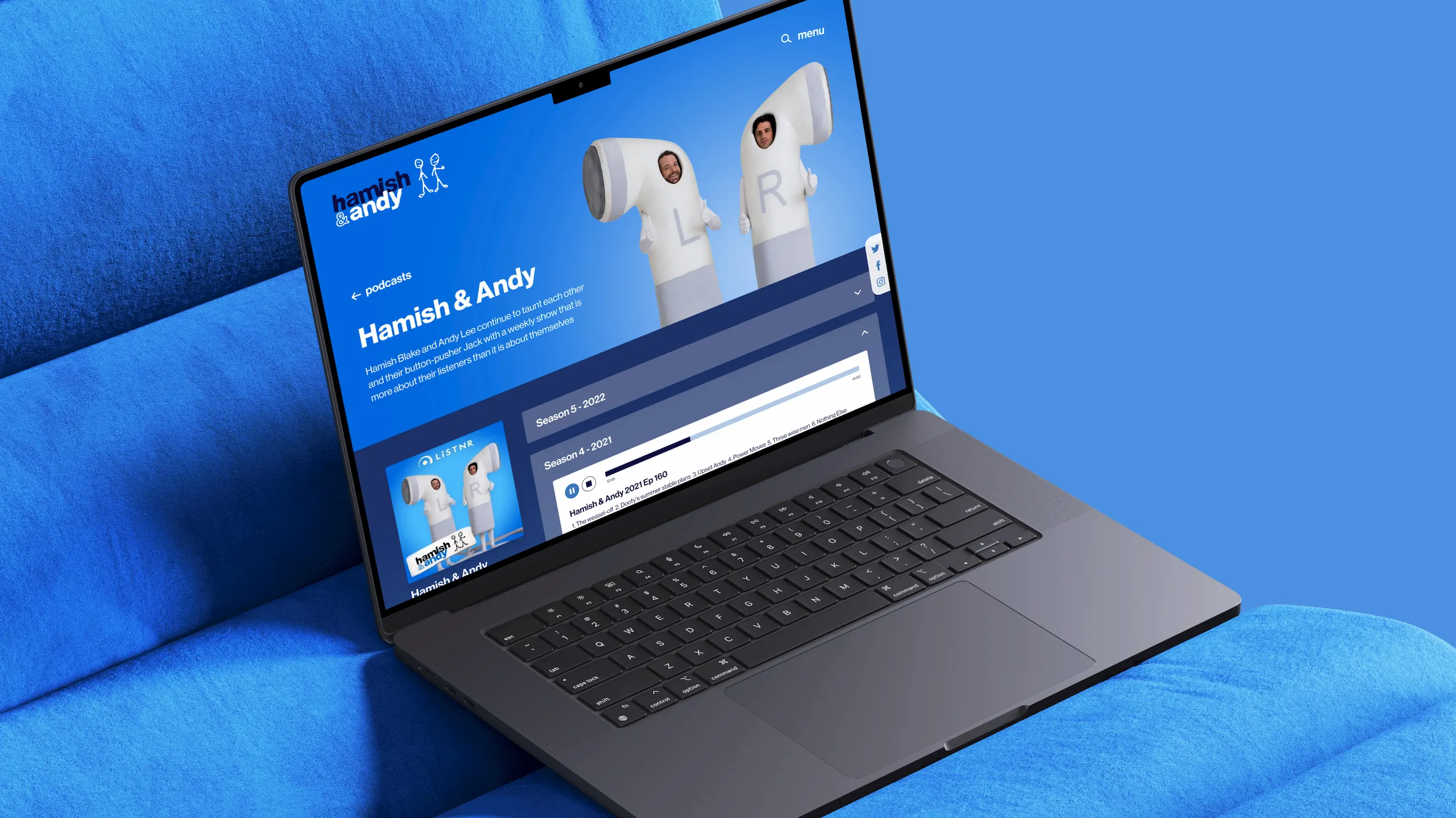
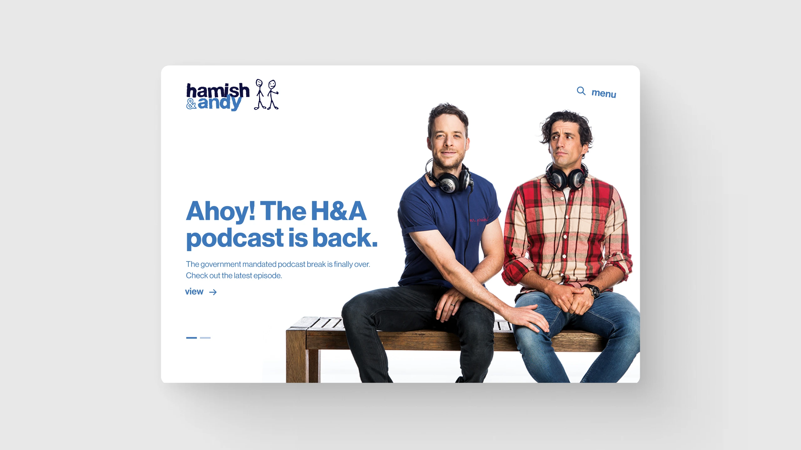
Website Services
All ServicesFrequently Asked Questions
01
What is the difference between UX and UI design?
UX focuses on the overall user experience, such as navigation, structure, and user journeys. UI focuses on the visual interface and brand expression, such as colours, fonts and assets. Both work together to create seamless, engaging digital experiences.
02
Will the design be mobile-friendly?
Yes – every site we design is responsive across desktop, tablet and mobile, ensuring a seamless, accessible experience on any device. While our process often begins with desktop to map out content hierarchy and showcase brand expression at full scale, mobile and tablet are never an afterthought. Our team applies mobile-first principles throughout, to ensure content, functionality and brand impact are preserved – not compromised – across every screen size.
03
What accessibility standards do you follow?
We design and develop to meet WCAG 2.1 AA/AAA standards, covering colour contrast, layout, text legibility and navigability.
04
What is a design system?
A design system is a library of reusable design and code elements, like buttons, forms and typography. It also includes rules and documentation that guide how your brand looks and behaves across digital touchpoints. This ensures visual and functional consistency across all your marketing channels.
05
Does prototyping save time?
Yes. It reduces costly changes later by validating user journeys early, speeding up the design process while improving accuracy for development.


