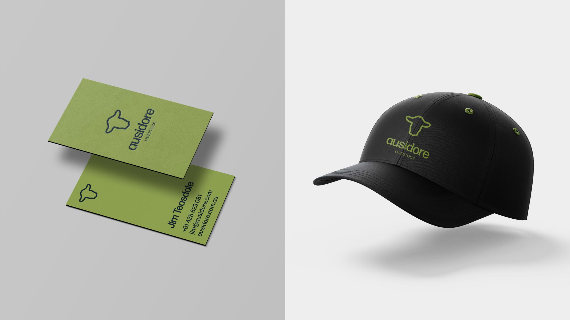

Newly formed livestock company, Ausidore, came to us for branding with brief that stressed their desire for an identity that felt approachable, traditional and professional. Knowing the sensitivities that exist around the livestock industry, we worked to embody Ausidore’s point of difference, which is defined by their commitment to animal health and welfare. The new Ausidore logo, in particular, was a key aspect of this job. We created something that’s immediately identifiable, yet friendly in its soft edges and curves. Paired with a modern typeface set in lowercase, the brand is positioned to feel personable, congenial and honest, while maintaining a level of professionalism.
Services