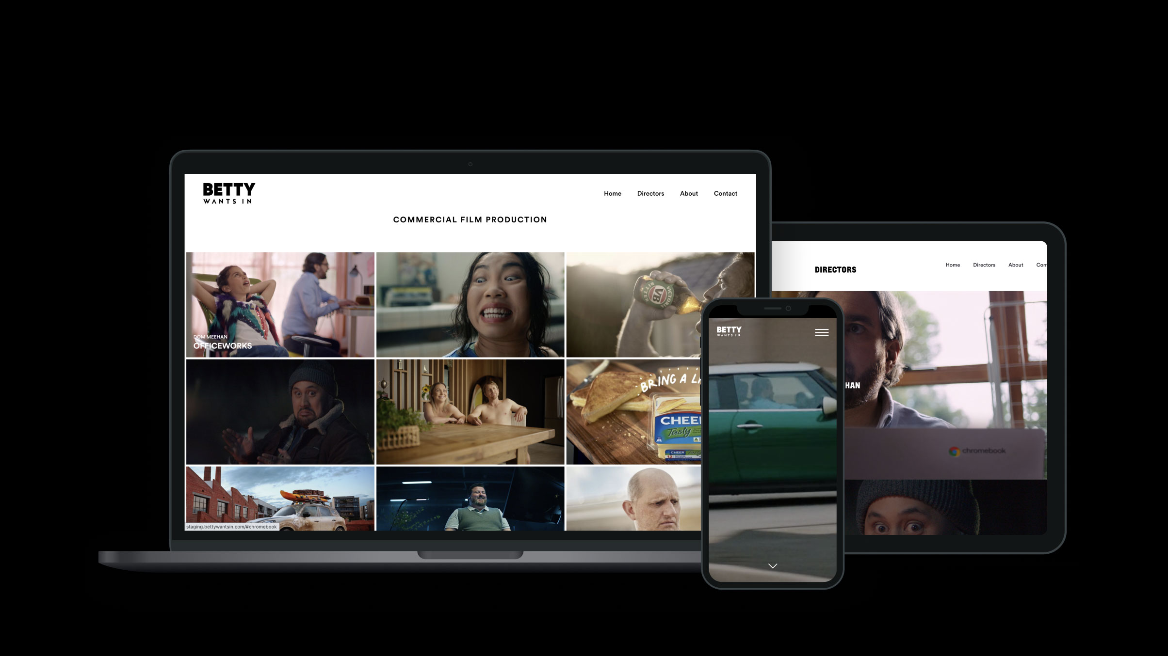
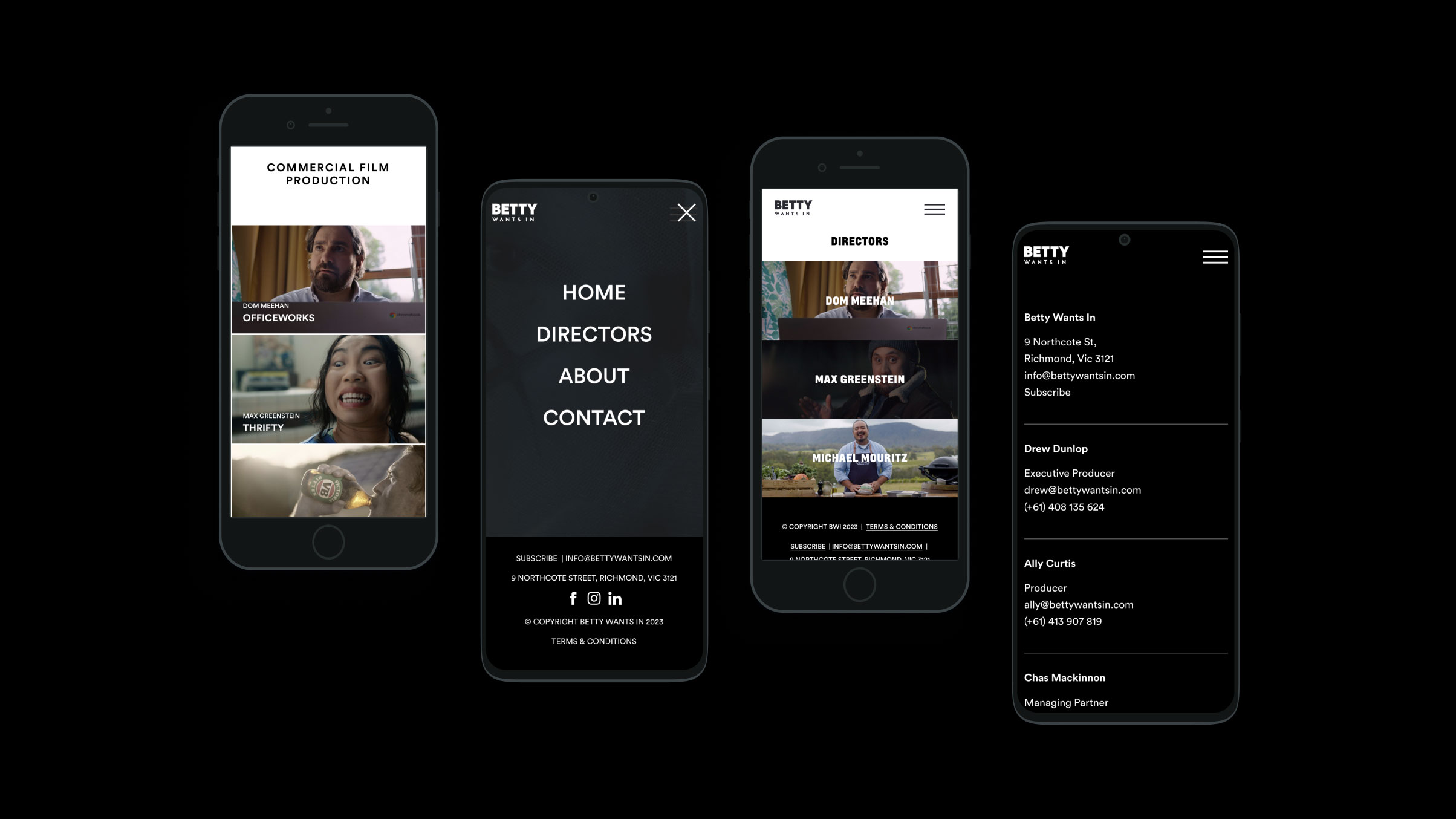
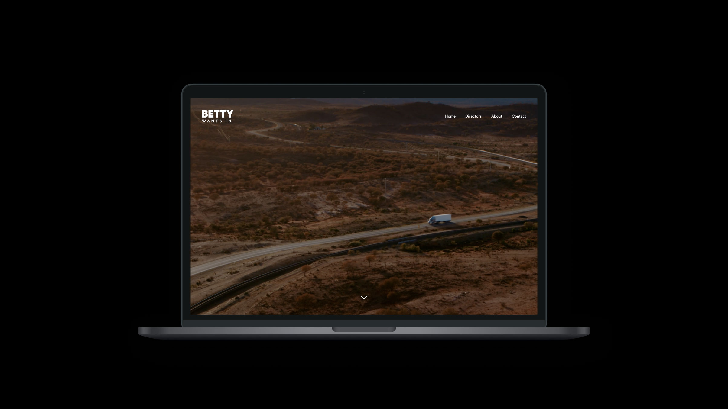
Betty Wants In’s single-page site wasn’t working for them – as their portfolio had grown, the site had become cluttered. So, for their new website, we stretched out the pages, making it cleaner, cutting away unused elements, and really letting the work speak for itself. It’s an all together more impressive feel from the moment you arrive on the site and are greeted with a full-screen video – visually beautiful and confident (as you’d want from a video production company); while delivering fast information in a more user-friendly way. By creating a portfolio page for each director, we built an environment for the work to take up space without overwhelming. Audiences not only get a feel for an individual’s unique approach and style, but for the breadth and depth of experience that comes with the ability to showcase more projects. And though it’s a site of few words, we chose a new typography that better reflects the brand and their new-look.


